by Webbing Team | July 21, 2022
We are a bigger and stronger company today than we were twelve years ago.
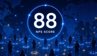
We built a robust global cellular network and powerful management platform that deliver a cost-effective, streamlined, centralized, and scalable means of implementing, controlling, monitoring, and optimizing data usage for global Enterprises and IoT deployments.
Today, enterprises in all industries trust us to deliver innovative, global data connectivity for devices wherever they are located. Our leading-edge solutions and revolutionary SIM technology are changing the way companies are connecting their workforce and machines. We wanted a logo and presence that communicates that. In this blog, we will share some of the ideas behind our new design.
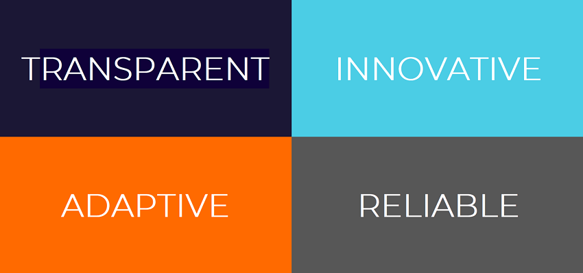
Brand Attributes
Webbing was founded with the objective to lead the evolution to sustainable global data connectivity with innovative, high-quality, and scalable technology. Light Blue has been our main color from day one. Light Blue = Innovative, one of our core values. We believe that enterprises should have tailor made, bulletproof, future ready connectivity under their control. This means that we are pushing industry boundaries with connectivity solutions that empower companies to enable the best connectivity for their business at any point in time.
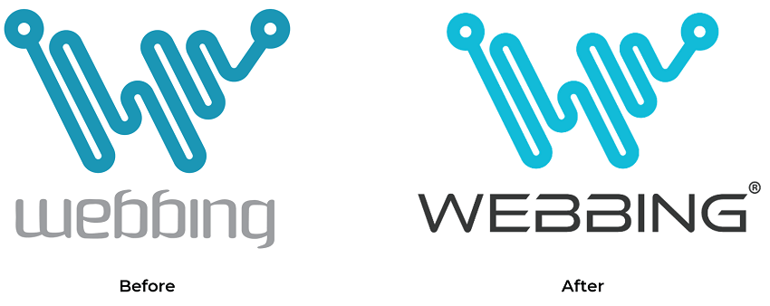
Our signature W represents a company continuously on the move and our commitment to providing continuous data connectivity between business, people and things wherever the device is located. Yet it’s curviness represents Webbing’s human talent powering our customers’ connectivity needs.
Finally, our new logo is sharper and focused. It represents Webbing’s nontraditional scientific sensibility that powers our technology and accelerates us forward.
Our logo is not the only thing we changed. We also have a new website, showcasing our evolving product offering and industry applications. Check our new website to find out how connectivity is powering the future.
Reach out to learn more about Webbing’s connectivity solutions.